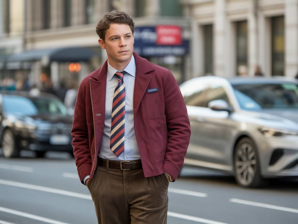
There’s a specific moment, usually around 8:17 a.m., when you pass a mirror, coffee in hand, and ask yourself a deeply spiritual question: “Do I look like a guy who has his life together… or like a man who got dressed in the dark during a fire drill?”
The answer, most of the time, is about color. Not the clothes themselves. Not the brand. The colors you decided to stack on your body like a walking mood board.
I’m not going to talk to you about “beige aesthetics” or runway trends that require a stylist, a ring light, and a therapist. I’m talking about real-life color combinations I actually wear — the ones that make people think your outfit is way more expensive than it really is.
Let’s open the wardrobe and cheat the system a little.
Why Color Makes You Look Rich (Even When Your Bank Account Disagrees)
Luxury brands rarely scream with color. They whisper. Calm, muted, controlled palettes. Neutrals. Deep tones. Nothing too shiny, nothing too loud. Why? Because expensive clothes don’t try to impress you. They assume you’re already impressed.
So the trick is simple:
- Use colors that look intentional, not accidental.
- Keep contrast under control (no red-on-neon crime scenes).
- Lean on tones that age well: navy, brown, cream, charcoal, olive.
Below are the exact color combinations I wear on repeat — the ones that somehow make a Uniqlo T-shirt and a 40-dollar pair of chinos look like they just stepped off a minimalist designer rack.
Combination #1: Navy + White + Brown (The “I Read Contracts for Fun” Look)
If I had to pick one combo to live in forever, it would be this: navy, white, and brown. It’s the menswear equivalent of a well-made espresso: simple, strong, and surprisingly addictive.
Here’s how I usually wear it:
- Top: Navy cotton or wool sweater, or a navy overshirt.
- Bottom: White or off-white jeans/chinos (slim or straight, not sprayed-on).
- Shoes: Brown leather — loafers, derbies, or even clean brown sneakers.
- Watch/Details: Brown leather strap, maybe a silver or steel watch case.
Why it looks expensive:
- Navy already screams “tailored”. It’s the color of suits, officer uniforms, and guys who somehow know what “APR” means.
- White or off-white pants look risky, which makes them look intentional. Nobody stumbles into white trousers by accident.
- Brown leather adds warmth and texture. Fake leather struggles with brown; real leather ages like a good plot twist.
Wear this combo and suddenly strangers assume you own at least one boat. You don’t. You barely own a working umbrella. But it’s nice that they think that, isn’t it?
Combination #2: Charcoal Grey + Black + White (The “Quiet Luxury, Loud Opinions” Uniform)
Most guys either run from black because it feels “too intense” or they drown in it like they’re auditioning for a vampire reboot. The middle ground? Mix it with charcoal and white.
How I wear it:
- Top: Charcoal hoodie, sweater, or turtleneck.
- Bottom: Black jeans or black tailored trousers.
- Shoes: Minimal white sneakers or black boots.
- Layer: Black wool coat or a black bomber if I’m being lazy.
Why it looks expensive:
- Charcoal is softer than pure black. It gives depth instead of turning you into a shadow.
- Black grounds the outfit. Especially if the fabric is matte and not shiny.
- White in small doses (sneakers, T-shirt peeking out, a shirt) breaks up the darkness and keeps you from looking like stage crew.
The key here is texture. A charcoal wool sweater with black jeans looks more expensive than a random branded hoodie with the same pants. No logos, just fabric doing its job quietly.
Combination #3: Olive Green + Beige + White (The “Accidentally Sophisticated” Combo)
Olive is one of those colors that turns basic outfits into something that looks curated. It feels masculine without screaming “tactical gear enthusiast”. Paired with beige and white, it lands somewhere between “I hike” and “I know where to find good natural wine.”
How I usually wear it:
- Top: Olive overshirt, field jacket, or lightweight bomber.
- Bottom: Beige chinos or stone-colored trousers.
- Shoes: White sneakers or light brown suede shoes.
- Underlayer: Plain white or off-white T-shirt.
Why it looks expensive:
- Olive is associated with military uniforms and utility wear — things built to last.
- Beige sits right in that “luxury casual” territory. Think trench coats, tailored chinos, hotels where the lobby smells like money.
- White keeps it fresh and clean, like you planned this and didn’t just grab the first shirt on the chair.
Bonus move: Swap the white T-shirt for a light grey or cream knit in colder weather. Suddenly you’re giving “city archaeologist with a trust fund” energy.
Combination #4: Camel + Navy + Denim (The “I Own Only Five Things but They’re All Good” Setup)
Camel is a power color that pretends to be gentle. Think camel coat, camel sweater, camel scarf. On its own, it can feel too “fashion guy.” But pair it with navy and denim, and it becomes quietly sharp.
My go-to combo:
- Outer layer: Camel coat or camel topcoat.
- Top: Navy sweater or navy hoodie.
- Bottom: Dark blue denim, straight or slim, minimal distressing.
- Shoes: Brown or tan leather boots, or white sneakers if I’m keeping it casual.
Why it looks expensive:
- Camel is heavily associated with designer outerwear.
- Navy + denim together create a layered blue effect without looking matchy-matchy.
- The whole palette is warm and approachable, yet structured.
Even if the coat isn’t designer, camel tricks the eye. It absorbs light nicely, photographs well, and makes even an H&M piece look a tier higher. Just steam it. A wrinkled camel coat is a crime.
Combination #5: All-Blue, Different Shades (The “I Thought This Through, Actually” Palette)
This is one of my favorites because it looks complex but is painfully easy: dress almost entirely in blue, but mix multiple shades.
Example from my actual, real, embarrassingly repeatable life:
- Top: Light blue Oxford shirt.
- Layer: Navy bomber or dark blue cardigan.
- Bottom: Mid-wash blue jeans or navy chinos.
- Shoes: White sneakers or brown loafers.
Why it looks expensive:
- Staying in one color family feels deliberate.
- Different shades of blue create depth without chaos.
- Blue is universally flattering, which your selfies will appreciate.
To avoid looking like a blueberry, keep one piece lighter (usually the shirt) and one deeper (the jacket). If everything is mid-tone, you end up… fine. And we’re aiming for “effortlessly sharp”, not “fine”.
Combination #6: Monochrome Neutrals (Grey, Stone, Ecru) – The “Clean Slate” Fit
On the days when I don’t want to think but also don’t want to look like I gave up, I go for soft neutrals all over: different shades of grey, stone, and off-white.
Standard formula:
- Top: Light grey sweatshirt or knit.
- Bottom: Stone or light beige chinos / ecru jeans.
- Shoes: White or light grey sneakers.
- Optional: Darker grey coat or jacket over everything.
Why it looks expensive:
- Light neutrals signal “I’m not afraid of dirt,” which weirdly reads as confidence.
- The eye sees a calm, cohesive silhouette.
- It’s the opposite of the graphic T-shirt chaos most guys default to.
This is also a sneaky good travel outfit: swap the chinos for tailored joggers in a similar shade, keep the colors consistent, and you look upgraded even in economy.
Combination #7: Dark Brown + Cream + Denim (The “Soft Luxury” Move)
Brown used to be the forgotten cousin of black and navy, but it’s quietly taking over my closet. Dark brown with cream and denim looks like you should be sipping coffee in some impossibly photogenic European café, even if you’re just commuting next to a guy eating chips at 8:30 a.m.
How I actually wear it:
- Top: Dark brown sweater or cardigan.
- Bottom: Cream or ecru jeans.
- Shoes: Brown suede boots or sneakers.
- Layer: Blue denim jacket or dark denim overshirt.
Why it looks expensive:
- Cream looks richer than pure white — softer, less harsh.
- Brown feels old-school in a good way, like vintage leather chairs and good whiskey.
- Denim keeps it grounded and casual so you don’t look costume-y.
Suede in particular plays very well with this combo. Suede looks expensive, even when it isn’t. Just maybe don’t wear it in biblical rain.
The Secret Sauce: Fabric, Fit, and Small Details
Color does the heavy lifting, but a bad fit can still sabotage the whole mission. A few rules I quietly live by when I’m trying to punch above my budget:
- Muted beats shiny. Shiny fabrics often look cheap unless they’re very high quality. Stick to matte cotton, wool, flannel, brushed textures.
- Avoid loud contrasts. Black and bright red? That’s not “rich guy”; that’s “sports team mascot”. Use contrast, but keep it controlled.
- Repeat at least one color. If your shoes, watch strap, and belt are all brown, your outfit looks tied together even if nothing is designer.
- Limit bright colors. One accent piece, max. A burgundy beanie in a navy/grey fit works. A neon hoodie with neon sneakers and a logo cap? Not so much.
And yes, it matters that your clothes are clean, ironed, and not falling apart at the seams. Expensive-looking outfits are allergic to fuzz, lint, and weird neck stains. So is everyone else, by the way.
Easy Color Rules You Can Steal Immediately
If you don’t want to memorize combinations, you can just follow a few cheat codes when you’re standing in front of the closet wondering why you own so many things and still “have nothing to wear.”
- Two neutrals + one hero color. Example: navy (hero) + white + brown. Or olive (hero) + beige + white.
- One dark, one mid, one light. Shoes dark, pants mid-tone, top light — or flip it.
- Keep the loudest color farthest from your face. If you insist on something bright, let it be the shoes or a small accessory.
- When in doubt, go navy. Navy is basically cheat mode for looking put-together.
Building a Small, Expensive-Looking Color Wardrobe
And because this is still the internet and someone will ask, yes — you can build all of these combinations from a small wardrobe if you choose the right base pieces.
If I had to strip it down to essentials that unlock nearly every combo above, I’d keep:
- Navy sweater or hoodie.
- White and light blue shirts/T-shirts.
- Olive overshirt or field jacket.
- Camel or beige coat.
- Dark denim + black jeans + beige/stone chinos + cream jeans.
- White sneakers + brown leather shoes/boots + one pair of clean black shoes.
From there, it’s just color mixing. You don’t need 40 items. You just need 10 good ones that like each other.
Think of your wardrobe like a small, well-written cast of characters. If they all have chemistry, you don’t need more people. You just need better dialogue between them — and in this case, that dialogue is color.
So tomorrow morning, when you’re standing in front of that mirror at 8:17 a.m., coffee in hand, ask a different question: not “Do I look rich?” but “Do these colors look like they belong together?”
If the answer is yes, you’re already halfway to expensive — no credit check required.


